6 Common Mistakes in Ecommerce Conversion Optimization
The phenomenon of Conversion Rate Optimization has come a long way from being the latest ‘in’ thing to an essential commodity that every store owner utilizes today to find out how they can push the envelope.
In short, everyone is striving to increase conversions these days. But while they go crazy with button colors and styles, they often make big mistakes in eCommerce conversion optimization that makes them miss the sweet spot of maximum potential in sales.
1. Not Optimizing the Entire Customer Journey
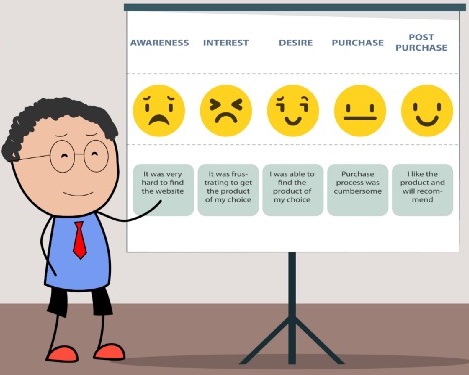
Ecommerce conversion rate optimization involves optimizing the whole customer journey rather than just the conversion metric.
The conversion journey actually starts from the very beginning – when the customer finds you and discovers your brand or product. That discovery can be through a paid ad, a social media post, or through a recommendation from a friend. And that journey goes all the way from the initial discovery or awareness till consideration, intent, and the final purchase.
Some areas that store owners often miss when optimizing their customer journey:
Metadata: In an effort to please the search engines, store owners often miss the importance of metadata, which is the first piece of copy, a potential buyer would see. Instead of creating metadata that reflects the intent of the page, it’s linking to; they cram in keywords to earn higher rankings.
When writing your meta titles and meta descriptions, make sure the copy establishes the intent of the page and convinces the buyer to click by stating what value you’ll be giving to the buyer.
Site speed: Another common mistake in CRO is not spending enough time and money to optimize the speed of your online store. Studies have suggested that site speed has a direct impact on conversions. So, if you want to get those sales up, you need to invest in the right technology and tools that will make it fast for your buyers to browse through your store and buy from you.
Check out our article on 7 Key Ways To Speed Up Your WordPress Site and Improve Performance
Checkout Process: Checkout is the oft-neglected stage of the online buying journey, and that’s why most cart abandonments occur at this stage. The more painful you make it for your customers to give you their money, the less likely they’re going to do it. To make the final conversion happen, make it easy for them.
Address Manager helps you optimize the checkout process of your WooCommerce store by letting buyers save multiple addresses in their account, so they don’t have to type them in every time they check out.
2. Super-Long Landing Pages That Aren’t Optimized for Conversions
Another fatal mistake store owners make is understanding the real purpose of a landing page and how it fits the customer journey.
Most people have the misconception that they need to make all CRO efforts when a visitor lands on their page. And so, they try to address all three stages of the customer journey on a single landing page: awareness, consideration, and decision.
The result is a super-long landing page where they are expecting the customer to keep reading and scroll down to eternity before they get a call to action to buy their product.
You need to understand what stage the visitor is at when they are visiting your landing page. If the visitor is coming from a paid ad or a social media post, they already have some sort of intent when they click. You have done the marketing already, and they are now considering which product to buy and if your product fits their need and solves their pain point.
And so, your landing page needs to address those concerns of the visitor instead of continuing to market to them when they land. Talk about your product features, how it will be a good fit for them, and also which products they should buy.
Also read: Six Best Practices for Ecommerce Landing Pages
Instead of marketing to your visitors, your eCommerce landing page should be optimized for conversions to happen fast. Make it easy and fast for your customers to buy from you. Include elements like search bar, filters, and also navigation to help them find what they need instead of expecting them to scroll down for a hidden CTA button at the bottom.
3. Not Taking a Deeper Look into Data
Another big mistake in eCommerce CRO is not diving deep into the data. To really get those conversions up, you need to gather all the data. You need data like heat maps, click maps, scroll maps, and site analytics to really understand you’re the behavior of your visitor and why they are taking a certain or not taking the action you want them to take.
Use that data to come up with a hypothesis. And then test that hypothesis using A/B testing.
It’s very easy these days to get all this data with so many free and reasonable tools that let you track and understand consumer behavior.
You should also conduct user testing by finding someone online who fits your customer’s persona and get them to share their screen on a zoom call while they perform a task you assign – like buy something from your site.
User testing lets you understand how easy and optimized your site is and what changes you need to deliver a smoother experience.
4. Not Optimizing Mobile for Conversions

With a large majority of consumers browsing from their phones, having a responsive website isn’t enough. You need a mobile-first strategy that optimizes the buying experience on mobile devices.
Make sure the entire sales funnel is optimized for mobile, not only the initial discovery but also the final checkout.
Instead of squishing everything in one column for mobile, you’ll need to make some structural changes to your site design and make sure things are structured in an optimized way to make it easy for customers on mobile to buy from you.
Read More: How to Create a Mobile Optimized Website For Your Business?
5. Doing Things, You Wouldn’t Normally Do in A Brick-and-Mortar Store
New things surface every day in CRO techniques. But instead of going after the latest fads, ask yourself: is it something you would normally do in a brick and mortar store? If it isn’t, it’s best to avoid it.
Here are some examples.
Popups: pop ups can be very annoying for your customers, especially if they pop up right when you land on a site. Imagine entering a store and a sales person popping up in front of you asking for your email address. It’s not a good experience. If you have a popup, test it and determine if it’s really making a difference to your bottom-line. Make it an exit-intent popup or embed it in the content of the page, so the customer doesn’t feel annoyed but still has an option to give their email address for some kind of an incentive.
Auto-rotating banners: Auto-rotating banners slow down your site and don’t deliver good customer experience at all. The picture changes just when the visitor is trying to read, and the next picture that shows up isn’t even about the same kind of product. Again, this is something you wouldn’t do in a retail store. You don’t keep changing products kept on an aisle on a rotational basis, do you?
6. Going All Wrong When Trying to Stand Out
Being a ‘purple cow’ doesn’t mean you change the shape of the cow. The cow remains the same. If you want to feed the cow, you know how to do it. If you want to milk it, you know how that works.
Standing out doesn’t mean you confuse your customers. Be clear and simple in your copy and site design. If it’s a button, it should be designed like a button and nothing else. If it’s a CTA, the copy should look like CTA and not some random phrase that makes you think twice before clicking it.
Want to up your sales game and increase revenues?
Codup helps you grow and scale beautifully with eCommerce development services that are geared for higher conversions.
Read Also
- Cybersecurity Checklist for Your Ecommerce Website
- Top 10 Features Checklist for Your eCommerce Site
- How to Start a Online Store For Your B2C Business
- How to build a WooCommerce B2B Wholesale Store
- Factors To Consider When Choosing a B2b eCommerce Platform