How to Create a Mobile Optimized Website For Your Business?

Smartphones are everywhere. They’re essential to our everyday lives in that we do just about everything with them. At present, there are about 3 billion people using smartphones with that number increasing every day.
The rise in smartphone penetration has meant that a majority of internet traffic is now being rerouted through the medium.
Mobile internet traffic has increased year after year, and it’s estimated to surpass desktop internet traffic.
Because of this shift to mobile, businesses are now becoming smarter too. Mobile optimization is now a major part of the digital experience and many businesses have done well on their end to provide a mobile-friendly user experience.
It makes sense because if you provide a bad mobile experience, your users are going to leave you for better options.
In this post, we’ll be discussing the ten methods you can use to optimize your website for mobile phones. Let’s start!
What is Mobile Design?

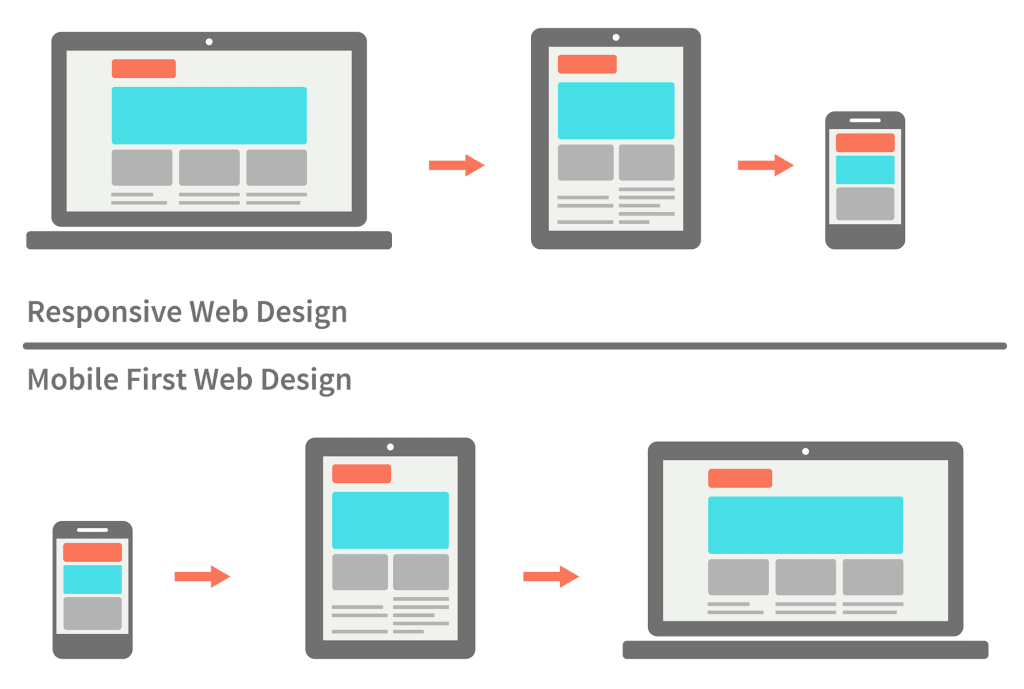
To understand mobile design, we first have to understand responsive web design.
It’s a UX concept that aims to provide a user experience based on the platform being used to access a particular website.
For example, if a user is accessing a website on a computer or a smartphone, the layout will be adjusted to the orientation of the device. So, for an iPhone 11, the layout of the website will be adjusted to the size of the platform.
Why Thinking Mobile-First Matters?
The mobile-first approach to graphic design is the main standard nowadays. Most people are now accessing websites from their phones so it makes sense that you tailor the experience for mobile.
In the past, the desktop first approach was the standard but due to the changes in user preference towards smartphones, the trend has changed significantly.
Designing for mobile first is a lot easier too. You see, a fully-fledged desktop application has a lot going on: from animations to designs, carousels, and more.
This doesn’t mean that you avoid them altogether in your mobile design, but rather you can cut down on the glitz and create a cleaner version of the site for mobile users.
Sure enough, some users have designed mobile applications with serious animations.
But the goal here is to create a mobile-first design. With that, you can create the basic outline for the desktop version, and then add all the necessary animations in the desktop version.
More often than not, the user experience deviates from mobile to desktop and the other way around. Customers look for a product on their smartphones and then purchase the product from their desktop.
Ten Ways to Optimize for Mobile Devices

Now that you have an understanding of the concept of mobile optimization, it’s time we look at ways it can prove beneficial to your business processes.
Research is important in this regard.
For mobile optimization, the first thing you need to look at is the range of mobile phones you will be targeting.
You don’t have to target all the mobile devices. Just a sample of the popular smartphones, and optimizing them, can prove equally beneficial.
With that, let’s look at some of the ways you can optimize your website for mobile devices.
1. Keep Things Simple

Keep things simple. We’ve already discussed this point, but it’s important to reiterate it in detail. There are certain factors you need to take into account before creating a website. Ask yourself the following questions:
What is your content? The type of content you have on your site determines how optimized you can make it.
What’s the ideal screen space distribution for your mobile-optimized website? You don’t have to shove everything in one place. Distribute your visuals and content across the website.
Whether you go for a website development expert or develop a website yourself, you should be able to plan a strategy that helps keeps things simple while translating the information to the user.
2. Plan Your Layout
Following up on the simplicity principle, you have to understand that web pages load faster than mobile pages. Adding too much in the mobile version of your website can lead to a slower loading website which can seriously hamper the user experience.
A streamlined user experience leads to a faster loading website. This, in turn, leads to a quicker user experience. For your website, you should develop a plan which ensures that your elements are kept at a minimum.
3. Focus On Navigation
A universally responsive navigation system can prove very useful for users on your website. A mobile-optimized website doesn’t have to balance just the content.
There also needs to be fluid navigation for all sorts of users to ensure that the user experience is not hampered in any way.
Ideally, you should create a navigation system that’s suited for users of all shapes and sizes.
This ensures that users interacting with the website will not feel uncomfortable. Moreover, it also helps avoid maneuvers like zooming in the screen to see or type something.
4. Use Compression Tools
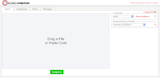
There are plenty of web design tools available on the internet today. But while that makes things easy for some, it reduces the ability to customize content.
But if you’re looking to add aesthetic flair, then these tools are quite helpful. One such range of tools includes HTML compressors.
These tools are good for optimization purposes since they help clean up code from unnecessary lines and spaces. By keeping the code clean, they help you speed up the website. There are compression tools not only for HTML, but for CSS, PHP, and JavaScript code as well.
The end goal of all these tools is that they’re highly effective in creating a mobile-optimized website.
5. Focus On Branding

Your main website is your inspiration for the mobile version: you can’t have one without the other. Whatever design principles you use on the main website, should translate to your mobile version with a few minor tweaks and modifications.
The design, typography, and colors matter a lot. Your mobile version should have these inherited from the traditional website. In a nutshell, you need to have key branding features, color schemes, and branding distributed through the mobile version of the website.
6. Utilize White Space

Maintaining balance is important; as is the crux of this post. Make sure that whatever content you use, you should maintain a balance between it and the design. A lack of harmony can lead to significant problems within your content, making it hard to read and see.
To maintain that harmony, you need to use white space inside your design. This ensures that your website content and the design are organized throughout the website and one does not overlap the other.
Besides the colors and the content, you should maintain balance in typography as well. Clearly typed text helps deliver content to the user in an effective manner.
7. Optimize for Screen Sizes
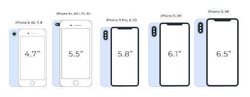
The modern market has a ton of smartphones available. All of them are of different screen orientations and sizes. To ensure a mobile-optimized website, you need to ensure that you optimize for every screen size.
Now, you shouldn’t be optimizing for everything. Instead, you can take standard industry sizes and optimize your website by those sizes.
8. Reduce Data Entry

For users, searching items and content on a website should be a simplified process. This is a major aspect of a mobile-optimized website. This ensures that users don’t have to type on small screens.
To solve this problem, you should make the user experience fluid by reducing the need for manual data entry. One way you can do this is through using drop-down menus which make content selection easier and more convenient.
9. Simplify Pop-Ups
One of the biggest roadblocks to the user experience is the presence of pop-ups. They’re unsightly regardless of when they pop up on the tab of the browser or open in a new tab. Hardly anyone goes back to a website after they are redirected through a pop-up.
Instead of using popups for your mobile-optimized site, you can include alerts or in-site closable pop-ups. Don’t get rid of them entirely, but make sure the user has somewhere back to go once they’ve seen the pop-ups.
10. Use Redirection
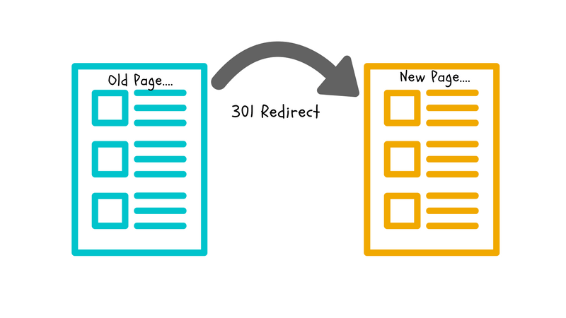
The final step in ensuring that your website is optimized for mobile phones is to apply redirects. This ensures that whenever a user clicks on the traditional version of your website, they are led to the mobile version through a redirect.
Final Words
From PWA’s to mobile responsive websites, there are so many ways in which businesses are now going mobile. Whether it’s a general website or an eCommerce store, as a business, there’s no denying the impact of mobile phones in the digital world.
It’s presented opportunities for businesses all across the board. If you’re one such business, then investing in mobile optimization is an advantage. While it might take some time to get started with the concept, it will be well worth the wait.
We hope you liked these tips on how to optimize a website for mobile users.
Read Also:
- Best Programming Language for Web Application Development
- Top 6 Benefits of Using Laravel Framework for Your Web App
- PHP vs JavaScript For Web Development

